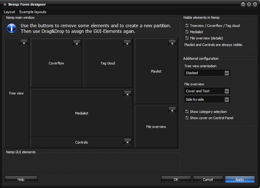
Form designer
The layout of the individual elements in the main window can be customized. In the Form Designer you can adjust the arrangement according to your wishes.

Basic concept
There are a total of seven elements that appear in the main window. For three of them, only one can be visible at a time.
- Tree view or
- Coverflow or
- Tag cloud
In addition the other areas
- Control (always visible)
- Playlist (always visible)
- File overview
- Medialist
The three pre-selection areas (tree view, coverflow and tag cloud) do not have to appear at the same place in the main window. Because of the rather different presentation, it makes sense, for example, to arrange the tree view in such a way that a high, narrow view is possible. For the coverflow, it makes more sense to have a wide, shallow view.
These seven elements must all be arranged on the form. Even if you plan not to display some of them in general.
Partitioning of the main window
The first step in designing a new layout is to successively divide the main window into sections. To do this, use the two buttons with the rectangular icons to split one area into two until you have created a total of seven areas. One button divides the area into two sub-areas that lie on top of each other, the other creates two sub-areas that lie next to each other. Perhaps the easiest way to think of this is as a multi-nested table where there are seven cells at the end.
You can also adjust the size of the areas during this design phase by moving the borders with the mouse. Of course, you can also adjust these later in the "real window" at any time.
Assigning the elements
In the second step, you drag and drop the seven GUI elements into the individual cells of the table created in the first step. The only limitation here is that the control element has a fixed predefined height. So it cannot be dragged into a cell that should have a variable height due to its arrangement in the table, because a single other element with variable height is to be displayed next to it.
The areas "J" and "K" in the screenshot below are therefore out of question for the control element, but the areas "F" and "G" are possible for it.

Hiding some elements, additional configuration
In the last step you can hide some elements. However, changes to these settings will be visible only in the real Nemp window. Furthermore, you can configure some elements:
- Tree view arrangement. Shows the two lists for categories and content side by side or on top of each other.
- Show category selection. If you don't need the division into several categories, you can hide this part.
- File overview: Select if and how the cover (or lyrics) and details are shown in this area, if this area is shown at all.
- Show Cover in Control Panel: The small cover in the control panel can be hidden in general. If the control panel becomes too narrow, it may be hidden automatically.
This "fine tuning" can also be done at any time in the main window via the Menu Settings→View→.
Click on "Apply" to transfer the current design to the real window.
